Spices and seasonings add an extra flavour to your favourite dishes, but properly packaging the spices is critical to carry the richness of flavours in dishes. The design must be so that it showcases and reflects all the flavours of spices on the packages. We offer masala Packaging Design solutions with different styles and colours for your hing masala packet, jeera masala pack, red chilli powder, chaat masala pouch, Mirchi powder packaging, garam masala powder etc. to make your SPICES BRAND stand out among all competitors in the market. By offering unique design combinations, and intriguing branding, the innovative designs can inspire consumers to add an extra flavour to their home-cooked dishes. Here are some creative and attractive spices packaging design samples to inspire you.
When it comes to Indian spices, your packaging is more than just the container. It is actually a storyteller. At DesignerPeople, we have earned the trust of India’s top spice brands by creating the most captivating spice packaging designs that blend creativity, tradition, and modern market trends. Our designs truly celebrate the essence of Indian spices by bringing together bold visuals, culturally inspired spice elements, and an unwavering focus on top-notch quality!
This will ensure that your products become the staple in every Indian kitchen! So, whether it’s the regular Haldi powders or the exotic spice blends, our custom packaging designs don’t just look great. Well, there’s more here. It build trust, convey authenticity, and create a connection with Indian consumers.
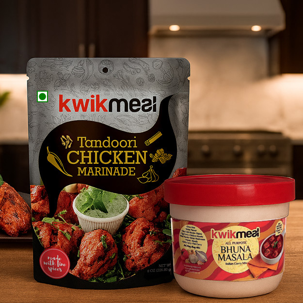
Pouch & Jar Label Design
Its a combination of bold fonts, and mouthwatering food images with clean, simple labels. The design instantly shows that its Pre-cooked masala paste for tandoori chicken or any Indian food curry, Its Design makes it easy for anyone to pick up and imagine how tasty their dish will turn out. Plus, the use of a modern look with bright colours makes it stand out on an International retail shelf!
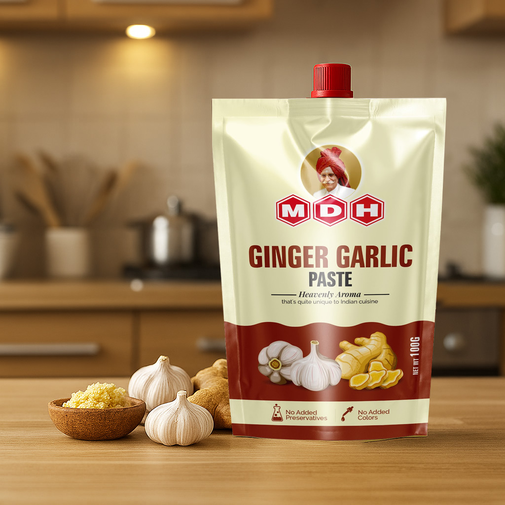
Ginger Garlic Pouch Paste Packaging
MDH’s packaging for ginger garlic paste looks vibrant and traditional, perfect for the Indian market. The artistic garlic and ginger illustrations are a great touch, clearly depicting the product’s essence. The flowing background and bold colors showcase the paste’s spreading nature, making it instantly recognizable.
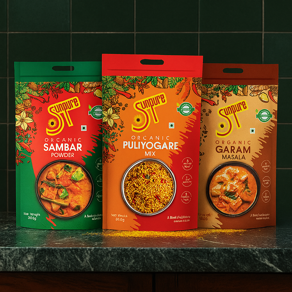
Pouch Designs
Vibrant and colorful look that feels fresh and organic to southern Indian Market. The rich red, green, and brown backgrounds instantly grab attention, while the floral and spice illustrations around the edges highlight the natural ingredients. The clear food images in the center make it easy for customers to connect with the product. Overall, it feels premium yet relatable, appealing to households that value quality and tradition.
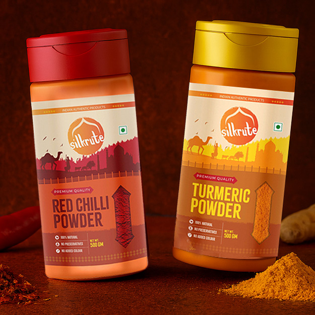
Red Chilli, Turmeric Label Design
Silkrute’s spice jars beautifully connect to Indian history! The earthy tones with spice-inspired colors are vibrant yet rooted. The silhouette background design reflects rich Indian heritage, while the smart arrow windows cleverly highlight the spice texture inside, adding premium appeal.
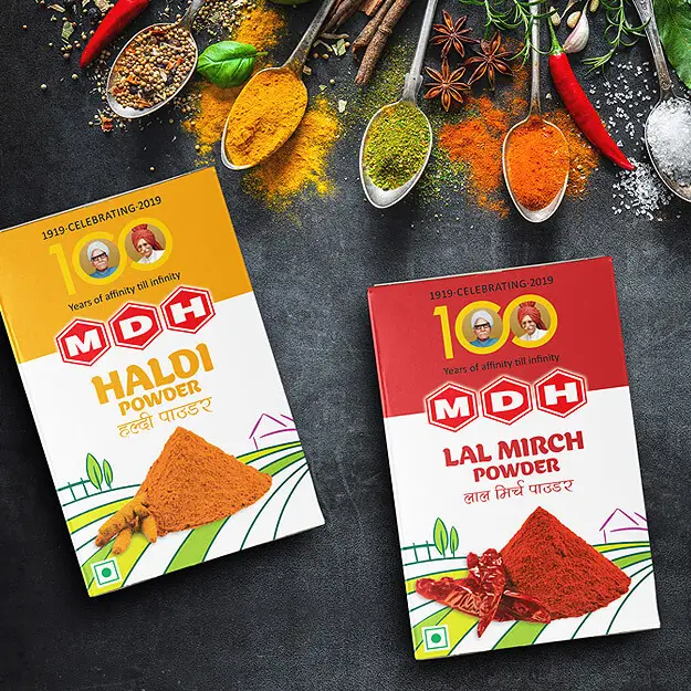
Masala Box Design
The bright, bold colors boxes (yellow for turmeric, red for chili) make it easy to identify the spices at a glance. The image of the founder (shah ji) at the top adds affinity, trust and heritage, while the clean design with large text and spice farm illustrations clearly shows what’s inside. It feels reliable and familiar to every Indian kitchen.
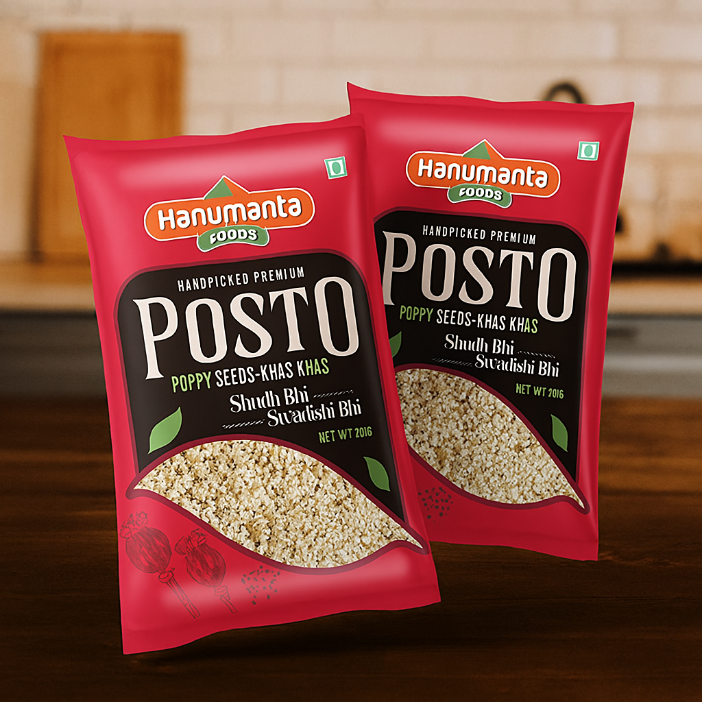
Khas Khas Pouch Packaging
The red background grabs attention, while the bold typography makes "Posto" stand out. The green accents and leaf illustrations add freshness, and the transparent window smartly shows the product. It’s clean, simple, and connects with the market.
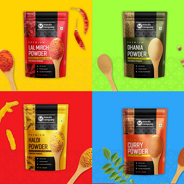
Lal Mirch, Dhania, Haldi, Curry Masala Pouch Design
Masala Company packaging is vibrant and classy! The bold colors instantly catch your eye and make it easy to identify the spices. The spoon filled with spices is a smart touch, showing quality upfront. Perfect balance of design and clarity.
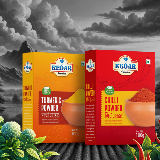
Turmeric, Chilli Powder Packaging Box Design
KEDAR packaging looks traditional yet bold! The stylish Hindi typography is perfect for connecting with a North Indian audience. The pot filled with spices immediately showcases product quality, and the raw material illustrations in the background add a natural, organic vibe.
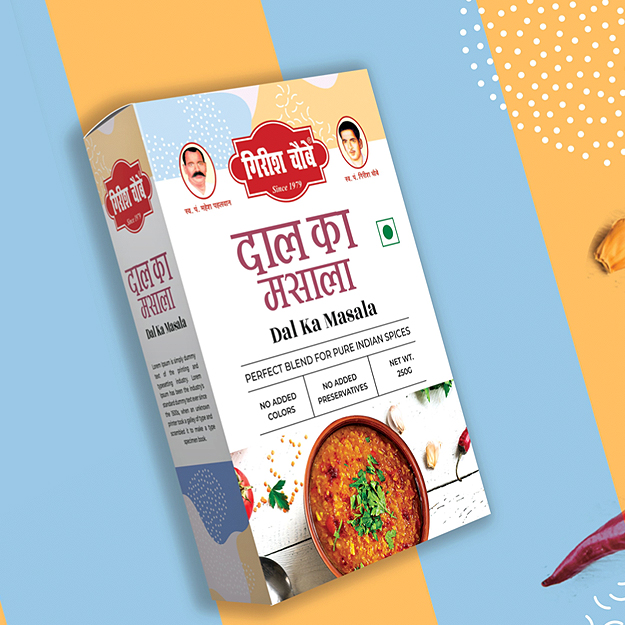
Dal Box Packaging Design
Girish Chobe’s Dal Ka Masala packaging smartly mixes tradition with a modern retail vibe. The bold typography feels classic yet fresh, while the minimalistic design keeps it clean and appealing. The infographic layout and 45-year legacy branding build trust.
At DesignerPeople, we don’t just design packaging—we craft pure experiences that resonate with your audience. Our team of excellent packaging experts collaborates closely with various spice brands in India to ensure their products not only catch the eye but also build lasting loyalty. Here’s how we elevate spice brands with innovative packaging solutions:
1. Packaging Design:
We design visually stunning packaging that highlights your brand’s identity and values. From traditional motifs to modern aesthetics, our spice packaging designs speak directly to the Indian consumer’s love for vibrant colors and cultural elements. Your spice packaging will not only stand out on shelves but also convey the essence of quality and authenticity.
2. Product Shape & Material Consultation:
Your spices deserve packaging that is as practical as it is beautiful! We will help you in selecting eco-friendly materials, functional shapes, and innovative formats that keep your products fresh and easy to use. Our designs align with consumer expectations, whether it’s a resealable pouch for everyday cooking or elegant glass jars for premium blends.
3. Product Positioning:
Understanding the competitive spice market in India, we help define how your spice brand will actually stand out. By analyzing various market trends, consumer behaviors, and competitor strategies out there, we create packaging that effectively communicates your product’s unique value. Our designs highlight amazing freshness, flavor, and authenticity to build instant credibility with your target audience.

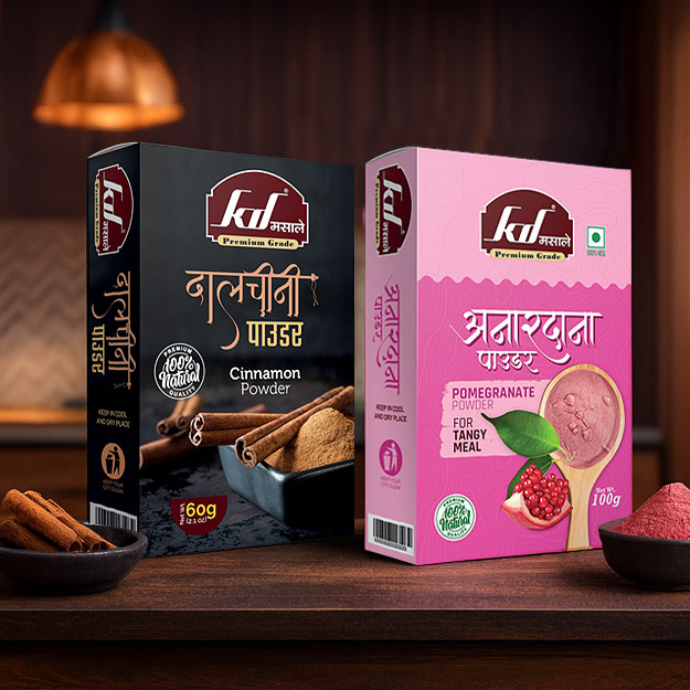
Cinnamon, Pomegranate Spice Powder Packaging
KD Masale packaging connects with Indian roots beautifully! The Panipat-based brand uses Hindi calligraphy-style fonts that feel authentic and local. The bold black and pink colors make each box stand out. Beautiful product photoshoots and the "100% natural" badge build trust instantly.
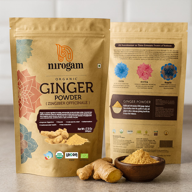
Ginger Powder Packaging
Nirogam packaging beats a modern sound with traditional one. Roots of Ayurveda in the Indian arch and subtle mandala patterns in the background and 3 flowers for Vata, Pitta and Kapha. It is a modern kind of the fonts used for the product, which can make things seemed fresh and nicely organic.
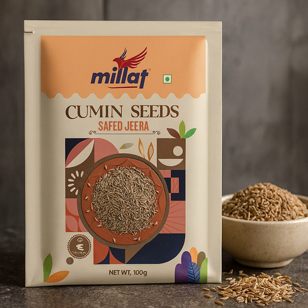
Safaid Zeera Packaging Design
The Millat Cumin Seeds packaging is smart with a handy sachet design, making it convenient. The abstract farm-field artwork in the background adds a natural feel. The cumin seeds in the center highlight the product's freshness and health benefits.
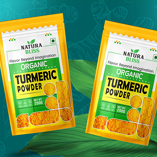
Organic Turmeric Powder Packaging
The NATURA BLISS packaging stands out with its bold yellow background, representing turmeric’s vibrant color. The geometric design windows give a modern touch, while the leafy illustrations emphasize the product’s natural and organic qualities. The font is clear and bold, grabbing attention easily.
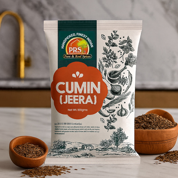
Creative jeere pouch design
The pouch design blends natural appeal with tradition using pencil art illustrations of spices and farm fields. The earthy tones of the packaging that makes up not only food quality but good taste, assures that the food product will taste great. With the rustic feel combined with the clean typography, it all works together for the trustworthy, relatable design.
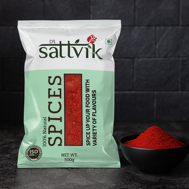
Organic chilli powder package
The Sattvik packaging reflects purity and divinity with its Hindi-inspired font style and a rose in the logo, adding elegance. The clean, uncluttered design and large transparent window boldly showcase product quality, building trust with customers.
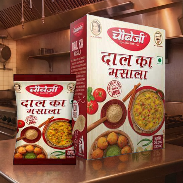
Chaubejee daal masala design
This "CHAUBEJEE" packaging aims to target traditional home cooks who value authenticity. With over 100 years of experience in making "DAAL KA MASALA," the design is meant to stand out from fake brands. The red and beige tones symbolize warmth and trust, reflecting family values.
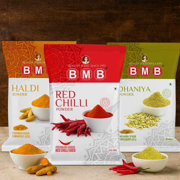
BMB spices pouch design
The BMB packaging is clean and modern, showing its premium side. The use of colours makes it easy to differentiate spices as well as the chakra artwork behind them to symbolize India. The prominent logo of BMB in red also asserts the 50-year-old trust of the brand’s existence.
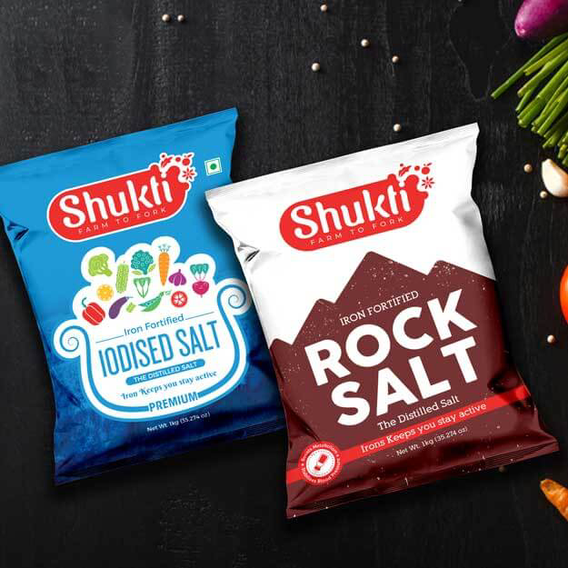
Salt packet design
Bold mountain illustration inside of the background represents the purity of rock salt in the packaging of Shukti. A pan with beautiful vegetable illustrations signifying healthier cooking means for iodized salt. The Indian touch is caught by extremely bright colors and clean design which catch local adult household's eye.
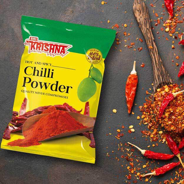
Chilli masala packet design
The Sri Krishna Chilli Powder packaging is aimed at tier-3 Indian cities. The bold yellow grabs attention in crowded shops, while the mango and chilli illustrations appeal to households making pickles. The design screams "homemade spice perfection" with a natural and spicy vibe.
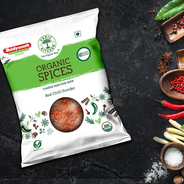
Organic chilli pouch
Vedic Kitchen highlights its organic and natural roots. The clean white design with green brush strokes perfectly conveys the purity of the product. Botanical illustrations bring out the spice story, targeting health-conscious and eco-friendly urban families.
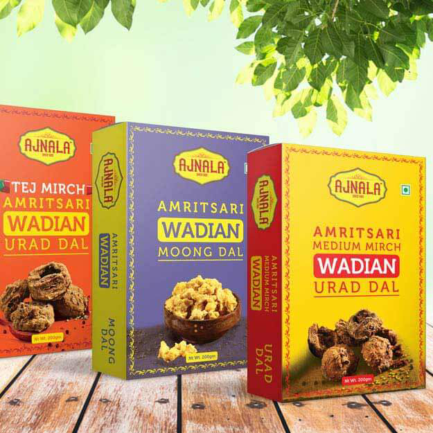
Ajnala amritsari wadiya box design
It’s targeting the urban and middle class consumers who will prefer genuine ready to cook products. The combination of the modern design with the spice illustrations of the Punjab’s rich culinary heritage, and the vibrant red and yellow colors have started to draw attention. It is a blend of culture with convenience.
Established over two decades ago
Over 8000+ business served