Medical packaging design must be done correctly to offer soothing effects for the patients. But medical packaging needs to be done, keeping the age of the patients in mind. By keeping the age factor in mind, We at DesignerPeople – one of the best medical Packaging Design agency, develop creative and excellent packaging solutions for medical products like health supplements, Sanitary Pads, Sanitary Napkin, Face Mask, Sanitizer, Ayurvedic etc. to meet their high standards. For babies, we make the packaging more attractive to kids’ pictures and colours. For adults, we try to keep the packaging design sophisticated and well-defined with light colours by clearly defining all the important facts.
Designing medical packaging is more than just looking good—it’s about product safety, earning the trust of users, and delivering clear, concise information. Whether it’s blister packs, syringes, vials, ampoules, pouches, or even cold chain packs, every element has to tick off boxes for sterility, durability, and regulatory compliance.
Medical Packaging doesn’t shout for attention with loud designs or selling USPs. Instead, it speaks quietly but effectively, reflecting the reliability and credibility of the product it holds. Think child-resistant closures that work (without feeling like solving a Rubik’s cube), eco-friendly materials that align with today’s sustainability goals, and labels that actually make sense at first glance.
To me, medical packaging is like a backstage hero—doing all the heavy lifting without the applause. It’s a “silent salesman,” as some say, delivering crucial details like dosage instructions, expiration dates, and storage tips. A poorly designed package? It’s a surefire way to make consumers second-guess the product. But a well-thought-out one? That inspires confidence and boosts brand credibility in a way that no marketing tagline ever could.
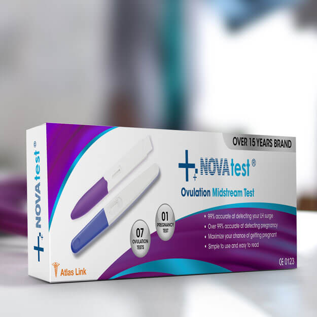
Nova medical paper box
This NOVA pack, with its purple and blue accents highlight the product's purpose. In the case of fonts used to present the information, it is easily legible since the fonts have been made BOLD on the product images used to present the information and they are real looking images that are easy to understand. "15 years" badge prominently written on the packaging makes it feel trustworthy.
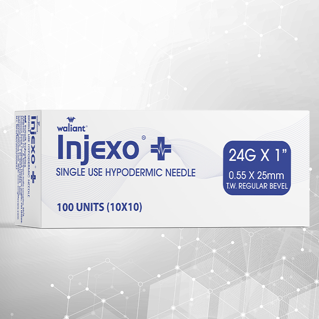
Injexo hypodermic needle packaging box
This Injexo packaging uses a clean and clinical design approach that aligns well with the medical industry. The blue and white colour palette immediately communicates trust, hygiene, and precision. Clear typography ensures that critical information such as “24G X 1”, “0.55 x 25mm”, and “Single Use Hypodermic Needle” is easy to read for healthcare professionals. The minimal layout keeps the focus on essential product specifications while maintaining a professional look. The subtle medical graphic elements add a modern touch without making the packaging look cluttered, making it suitable for hospitals, clinics, and pharmaceutical distributors.
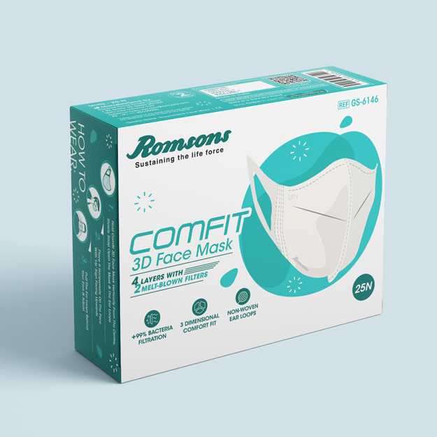
Romsons disposable paper box design
The COMFIT 3D Face Mask packaging looks modern and clean, with medical teal green colours enhancing the minimalist design. The clear product image highlight its 3D shape and comfort fit. Line art icons descriptions effectively highlight key features like "4 Layers" and "Non-Woven Ear Loops," ensuring clarity.
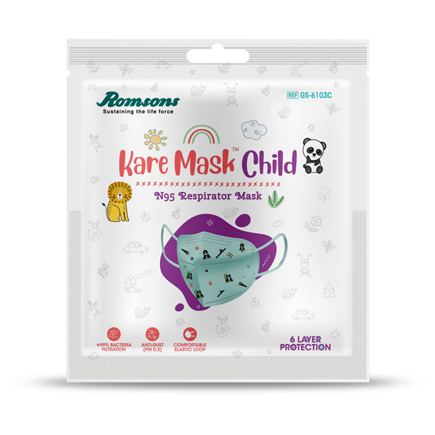
Romsons kids mask pouch packaging
This Kare Mask Child packaging is playful and child-friendly, with fun illustrations like pandas and lions that appeal to kids. The pastel colors and the generally gentle design answer to the brand’s caring image. Aids such as clear fonts and features such as 6 Layer Protection make the parents feel relieved and comfortable.
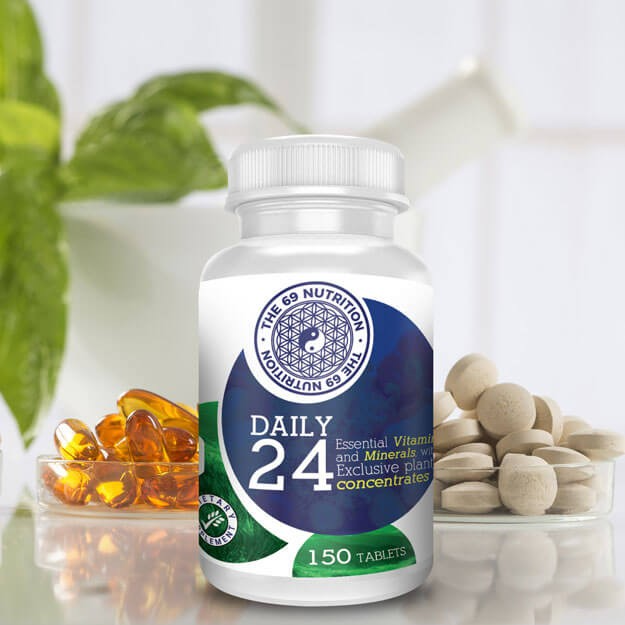
Daily nutrition bottle package
The Daily 24 supplement packaging from The 69 Nutrition features a clean, professional design with a white and deep blue color scheme. The geometric yin-yang logo and modern typography emphasize the product’s essential vitamins, minerals, and plant concentrates.
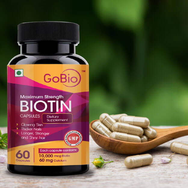
Capsule medical packaging
The GoBio Biotin Capsules packaging uses a sleek black bottle with vibrant accents of pink and orange, creating a strong visual appeal. They give more emphasis on Maximum Strength Biotin for radiant skin, stronger nails and healthy hair.
1. Fonts That Speak Clearly:
No one has time (or patience) for squinting at tiny, overly fancy text. Medical packaging needs to keep it simple—legible fonts, clear spacing, and enough contrast to make essential details pop. It’s a small thing that makes a big difference, especially for aged audience who might not have the sharpest eyesight.
2. Infographics for the Win :
Sometimes, words just aren’t enough. Visuals like icons or step-by-step diagrams can simplify even the most complex instructions. It’s all about helping patients get it right without having to play guessing games.
3. Usability That Balances Safety and Convenience:
Packaging that’s a nightmare to open or understand? Nobody wants that. But designing something intuitive—like child-proof caps that actually work and don’t frustrate adults—strikes the perfect balance between practicality and protection.
4. Durable, High-Quality Materials:
Let’s be real: flimsy packaging just doesn’t cut it in healthcare. High-quality materials aren’t just about compliance; they’re about protecting what’s inside and, in turn, protecting the patient’s trust in the brand. When someone sees robust packaging, they assume the product inside is just as reliable.

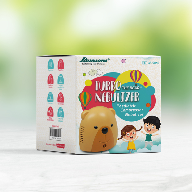
Romsons disposable paper box design
The Turbo Nebulizer by Romsons features a child-friendly design with a bear-shaped compressor, appealing to pediatric users. Its body has stunning colours that signify the function of this item – the paediatric compressor nebulizer The pictures also play a critical role to make children to have little or no fears about undergoing treatments using the product.
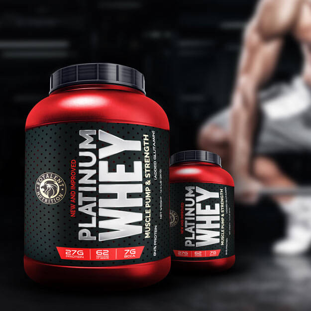
Whey protien powder pack design
The Platinum Whey packaging by Royale Nutrition delivers a bold and premium aesthetic, using a striking combination of red and black to evoke power and sophistication. where they put “New and Improved” tells it is a better product or development. This basic layout conveys a futuristic and a highly successful image of the company or product it is used for.
Established over two decades ago
Over 8000+ business served