
Guiltfree Industries Limited (GIL) is a part of RP Sanjiv Goenka Group and leads the group’s venture into the FMCG sector. Too Yumm! is the flagship brand of GIL, known for offering a wide variety of Western and Indian snacks with disruptive flavors. The brand has carved a niche in a crowded market through product and flavor innovations like Multigrain Chips and Wasabi Foxnuts. Now, Too Yumm! is set to enter the instant noodles category with a unique proposition featuring exciting South-Asian flavors.
Too Yumm! aimed to enter the competitive instant noodles market with a product that offers disruptive, appetizing, and unique flavors from South Asia. The challenge was to design packaging that:
The packaging was designed to attract urban millennials aged 15 to 30, who are known for their adventurous nature, trend-consciousness, and active presence on social media. Additionally, the client requested that the packaging reflect a unique Korean influence, particularly highlighting the product's spiciness. This added an extra layer of complexity to the design process, requiring a thoughtful approach to blend Korean elements with the brand's overall identity in a harmonious way.
At DesignerPeople, we approached the K-Bomb project with a thoughtful mix of research, creativity, and brand consistency. Here’s how we tackled the challenge:
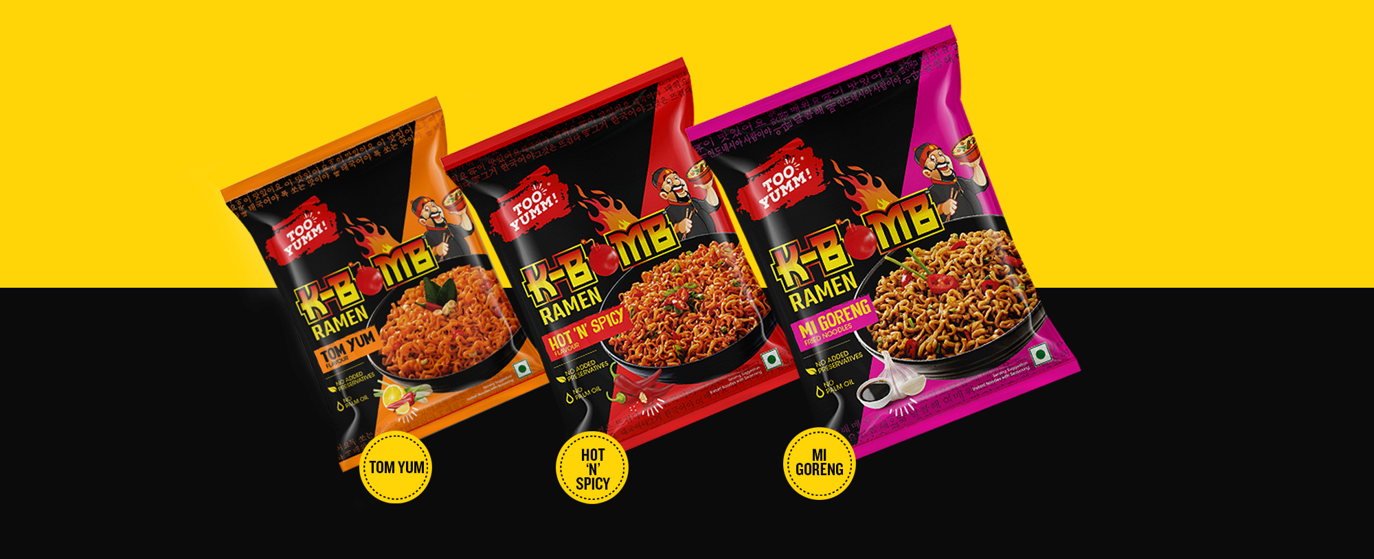
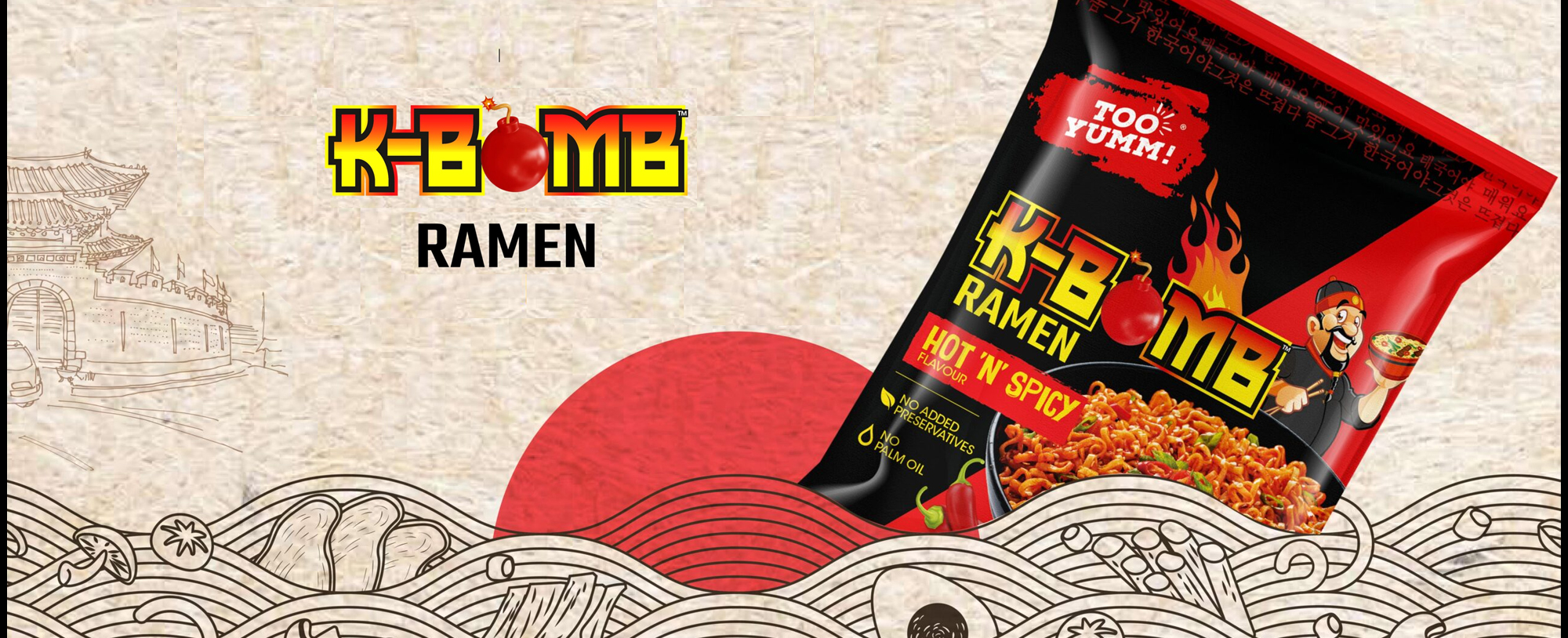
Logo and Imagery: We crafted a dynamic logo for K-Bomb, featuring bold, fiery visuals to represent the spicy flavors. The inclusion of a Korean chef and Korean script in the background enhanced authenticity and appealed to Gen Z consumers.
Design Elements: To emphasize the spiciness, we integrated fire motifs and opted for trendy, fresh, and edgy designs that aligned with the preferences of the target audience.
Visual Appeal: The packaging utilized vibrant colors and a sleek, sophisticated layout. Each flavor variant was differentiated with unique Pantone colors, making it easy for consumers to recognize their favorite flavors.
Authentic Imagery: The depiction of a Korean chef and the use of Korean text reinforced the authentic Korean experience.
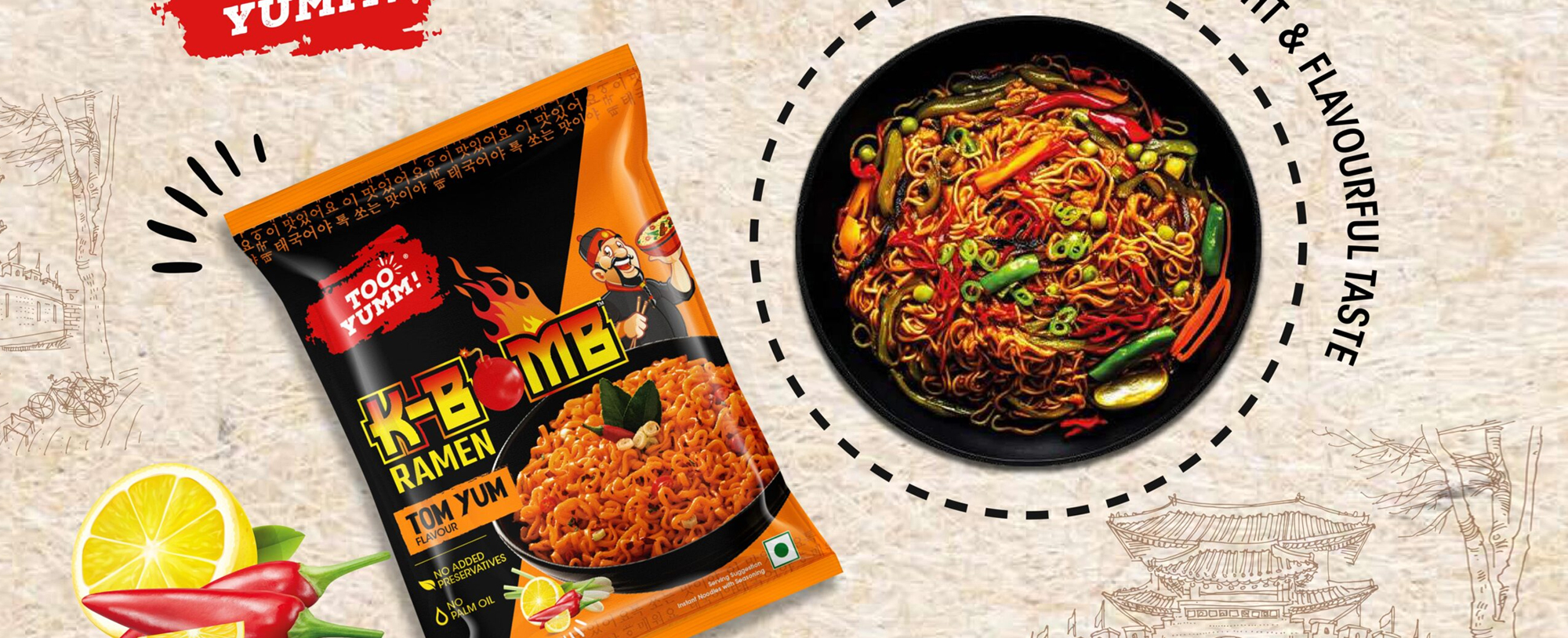
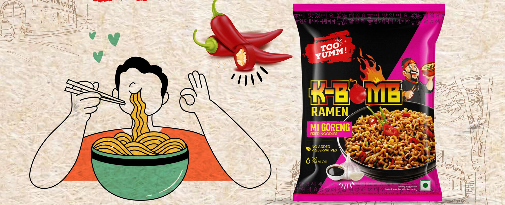
Cultural Integration: We harmonized the Too Yumm! brand colors with specific Pantone shades tailored to each variant, such as Tom Yum and Mi Goreng. This ensured the packaging felt familiar within the category while maintaining a distinct and unique look.
Modern Aesthetics: The design combined contemporary aesthetics with traditional elements, resulting in packaging that was both premium and relatable.
The final packaging design for Too Yumm’s K-Bomb noodles accomplished several key objectives:
Market Differentiation: The packaging stood out in a competitive market, blending trendy, edgy design with genuine cultural elements.
Consumer Engagement: The design sparked curiosity and encouraged trials among the target audience, with positive feedback specifically highlighting the appeal of the Korean chef imagery and fire motifs.
Brand Consistency: The packaging successfully maintained Too Yumm!’s brand identity while introducing an innovative product.
"We are delighted with the new packaging design for our K-Bomb noodles. It perfectly captures the spirit of Too Yumm! while resonating with our target audience. The design is not only trendy and edgy but also emphasizes our dedication to offering unique flavors. The response has been overwhelmingly positive." – Too Yumm Team
The successful packaging design for Too Yumm Instant Noodles illustrates the effectiveness of blending cultural elements with brand identity to create a product that stands out. This project aligns with DesignerPeople’s commitment to delivering impactful, consumer-centric designs that connect with the audience and drive success in the market.
TOO YUMM!
