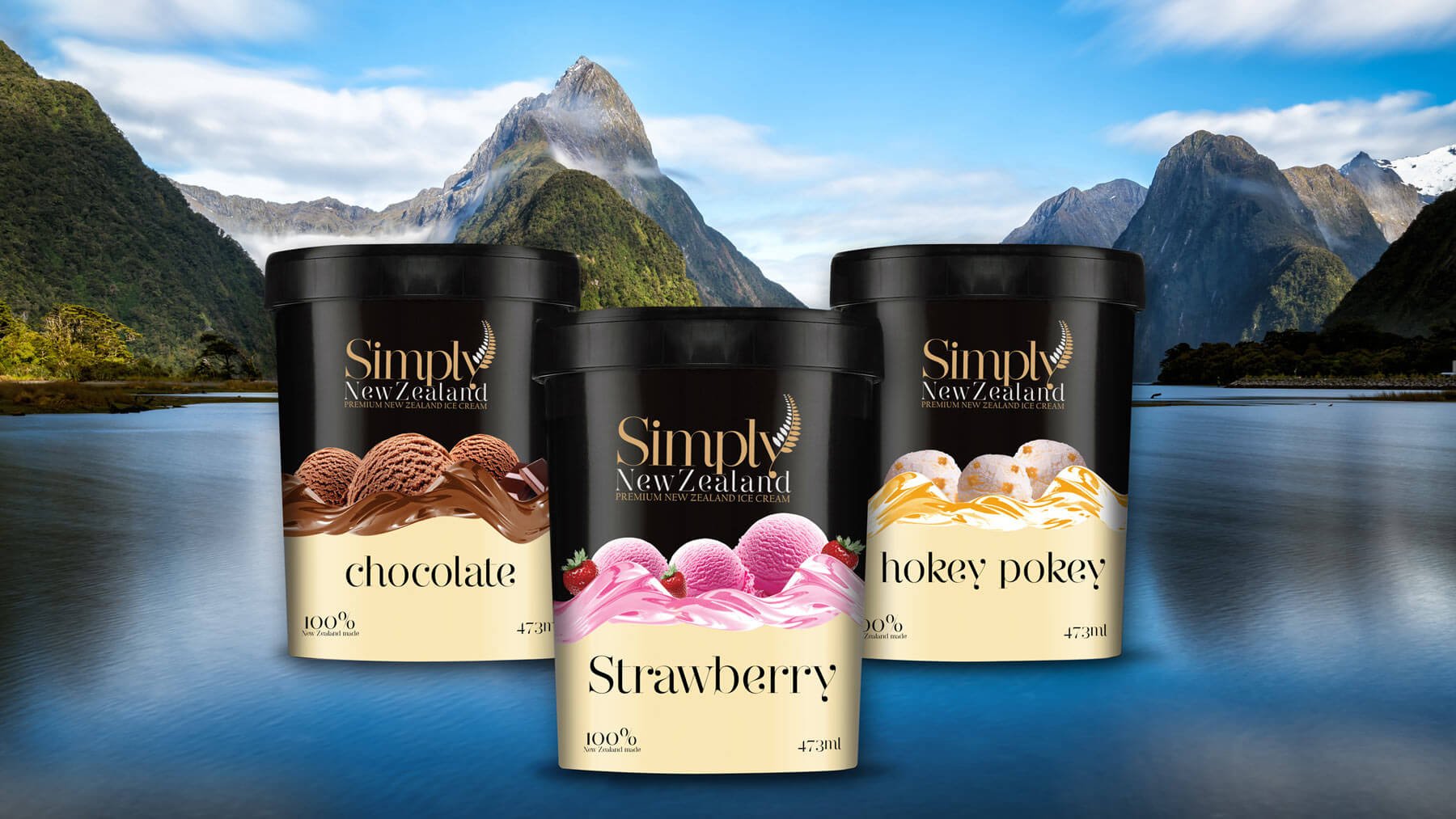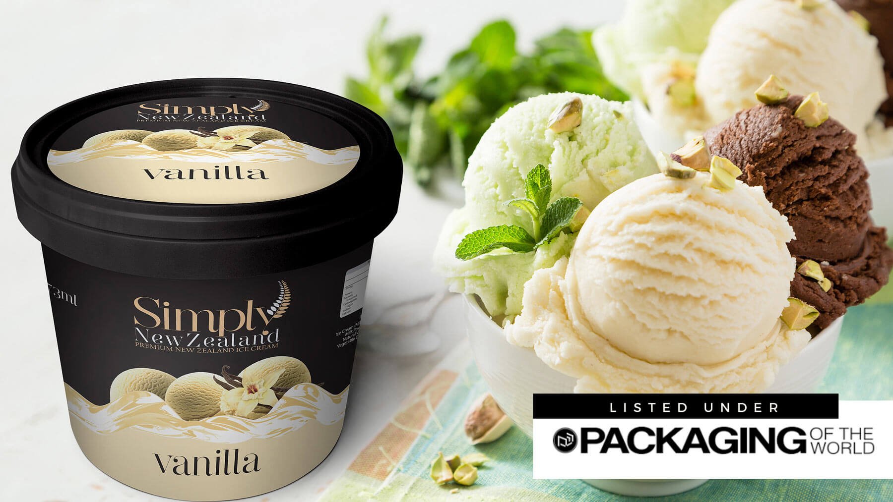


After several years of dedicated involvement in the Ice Cream industry, Hayden and Viktoriya Mc Kearney founded a brand called SIMPLY NEW ZEALAND. They aim to develop high-quality New Zealand dairy ice cream for the Chinese market; they source ingredients from well-established farms in the South Island of New Zealand and handpicked fruits from the finest orchards of the North Island of New Zealand.
DesignerPeople did a social, cultural and geographical analysis of the country's target group. Inculcated traditional value importance into packaging design by collaborating with colours with a unique value, such as Black, white, Red are the national colours of the Maori people of New Zealand.
Brand strategy colour Gold was rendered to depict the premium sector, and the nutritional value is highlighted. To give a more ethnic touch silver Fern image inspired by the New Zealand fern tree was introduced in Logo to represent the purity of the place.
SIMPLY NEW ZEALAND


