Colour is one of the essential parts of branding and product packaging design. A good branding agency knows colours has the power to evoke emotions regarding the product, either positive or negative before the consumer knows about the brand. Let’s put it this way! You walk into a store and see multiple products lined up on a shelf. It only takes a few seconds for a customer to pick one out of several products they have never used before, just based on how attractive the packaging is. Your mind gets an idea of a product’s quality based on its packaging design.
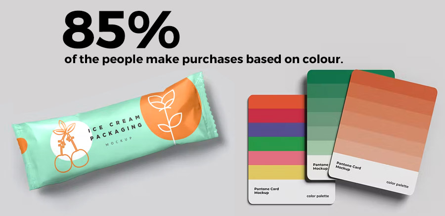
An ideal packaging design company helps you choose a colour palette and a brand design that would act as a promising visual depiction of your brand, add value, carry a message, and directly influence the client’s decision to purchase. It functions as a catalyst for your brand as 85% of the people make purchases based on colour. (Source)
Table of Contents
How do Brand & Packaging Colour Palette Influence Marketing?
The foremost and communicative aspect of any design, Colour, is the leading approach for any successful branding and packaging design. It involves aesthetic features and psychological factors—the connection a client’s brain makes with specific colours limits their distance on marketing aspects. Therefore, choosing the brand’s ideal colour palette for advertisement and marketing requires study and research to ensure that the colour actively expresses the brand and reflects its true identity.
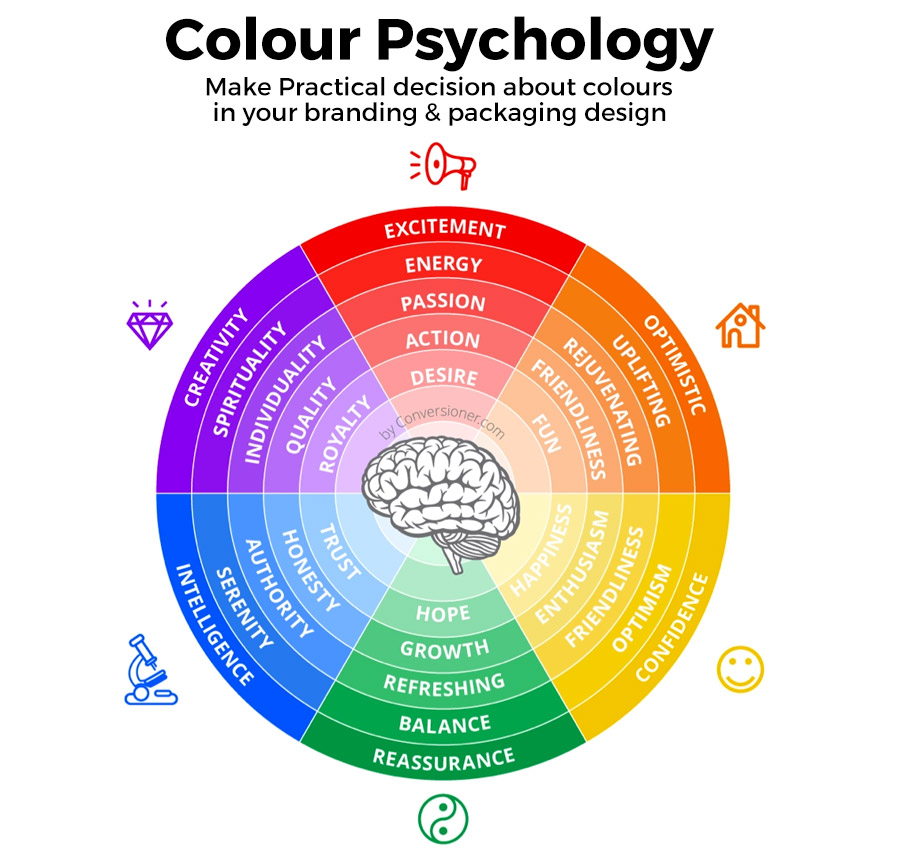
The colours that we look at around us in the industry for advertising are a part of the branding strategy. Companies make a massive investment of time and money to develop the correct colour palette for their brand and packaging design. As individuals, we have different colour psychology that influences our mindset and leads in decision-making.
How do the Right Colours Show off your Brand Personality & appeal to your audience?
Colours are visual presenters that speak volumes about the brand and its values. Brands like Facebook, Twitter, IBM, and Citibank use Blue as their supreme branding colour. Similarly, Lego, Coca Cola, and Netflix use Red as their superior colour. It is not a coincidence but a well-planned branding and marketing strategy to enhance the effectiveness of advertising and influence the consumers.
As a business, you want to construct a solid emotional connection with the audience, which would further influence their decision and thought regarding the brand. An ideal packaging design agency would prioritize the science behind the psychological factors of colours.
Psychology Behind Every colour in Branding & Packaging
Colours in branding can influence the perception of the audience regarding your product. Some brands spend an enormous amount of time and money trying to pick up the perfect colour palette for their branding, whilst others choose them randomly or merely based on their general preferences or the recommendation of a friend. To develop a reliable relationship with consumers, you need to rely on colour psychology, which studies human behaviour and decisions influenced by colour.
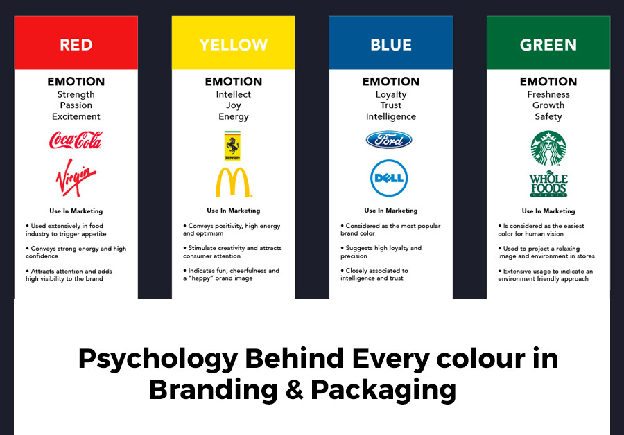
Colour design requires more than just a random choice as it greatly influences the brand identity in the industry. Some of the colours commonly used and the meaning behind them are listed below:
- Red is the colour of action, energy, excitement and attention. Youtube, Coca Cola uses red as their branding colour.
- On the other hand, blue is a prevalent choice for brand design. It depicts intelligence, trust and peace, used by worldwide recognized companies like IBM, Twitter, Facebook etc.
- Orange is associated with creativity, success and friendship. Fanta and Nickelodeon are leading brands that use an orange colour palette for branding design.
- Pink stands for feminity, love and naivety and acquires leading brands like Barbie and Victoria’s Secret.
What factors influence colour palette selection?
While making a colour palette selection, the brand personality and message you want to convey to the consumers are to be kept in mind. Not doing so will only send a lack of clarity to the audience’s minds, resulting in complete failure of the objective.
Colour differentiation depends on the age and gender of the people. It’s a common perception of people that blue is the colour of boys and pink is a feminine colour. Likewise, the customer’s perception is critical in selecting a colour palette and designing packages. Blue depicts peace and trust and hence suitable companies looking to build a trustworthy relationship with their clients. A brand focusing on environmental issues should use green to portray harmony and peace.
Importance of Brand & Packaging Colours
Think of a food delivery app. What is your perception regarding the branding colour and display? Now visualize the same elements for a garment brand. You are likely to have two completely different perceptions in your mind. The colour palette of any brand design remains the foremost factor in determining the message conveyed to the audience by the brand and the nature of the service offered by creating awareness about the same.
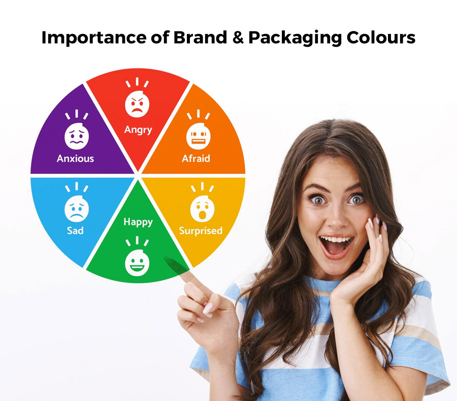
We’ll talk about some of the significant importance of colours in branding and packaging design.
Various colours elicit different feelings.
Consumers choose a product over competitors based on colour in branding, and therefore colour palette in packaging design needs to be strategic. Red is associated with evoking action and stimulating appetite, thus, being used by food chains like KFC and Coca Cola.
Brand colours have a significant impact on purchasing decisions
Picture yourself in a grocery store where you pick up one product from a shelf filled with goods from unknown brands. A Product will trigger your mind’s interest based on the brand packaging colour. If a company deals with organic products, the relevant colour palette for the package design will be shades of green. Green depicts the nature, growth and eco-friendly aspect of the brand.
Increasing brand recognition
Brand colours impact human behaviour and evoke emotions which ultimately lead to decision making. An ideal branding and packaging design company will wisely choose an appropriate colour palette concerning your target audience, spurring action among the consumers by promoting awareness and interaction.
Advantage of choosing the Right Brand & Packaging Colours
The process of brand building is similar to the construction of any equipment, which requires necessary tools and guidelines to be kept in mind to attain success to function smoothly. Let’s look at a few points to pay attention to the consumer’s desire and create a reliable brand identity in the industry.
Create a brand identity
A brand identity represents the values depicted by the organization, its interaction with the customers and the impression made on the mind, shaping the consumers’ perception. It gives an overview of brand personality and what it promises its audience.

A strategic colour choice for packaging design constructs a unique identity to stand out from competitors in the market and appeals to the consumers.
Identify your target audience and their affiliations
A wise approach for colour palette selection for packaging design depends on gender, age, literacy, cultural difference, economic stability etc. Hence, it is essential to keep the target audience in mind. The colours chosen for branding design should adhere to the consumer’s desire, requirement and inspiration.

The colour grey, in colour psychology, represents symmetry and impartiality. Although few people consider it dull, the colour is also used in typical graphics and fonts to appeal to the mass audience. Apple uses grey colour in their laptops and phones to satisfy the need of the mass audience and for neutrality.
Represent the product
The colour and packaging design should tell the audience about the contents of the products. We are familiar with how colours depict the nature of a product and its power to influence the mind of consumers.

The appearance of a product should give a slight idea about the composition of the product contents. A shampoo bottle with green colour and packaging design would indicate its organic and natural components, evoking the consumer’s attention to make a purchase.
Research your competition
A good packaging and designing company will construct a branding strategy ensuring that your brand stands out differently from the competitors instead of blending within the existing organization. Choosing a colour palette different from your competitors will make your brand design perceived and recalled in the industry.

Netflix and Spotify are two leading entertainment industries that use contrasting colour palettes to get the better spotlight.
Explain what the product is for
The choice of the colour and design packaging should be able to communicate the product’s purpose to its consumers. We are now well aware of how different colours give contrasting portrayals. Which category does your product come under, whether Luxurious or affordable? Whether you want the consumers to think about your product as Modern or classic? Is the nature of your product feminine or masculine? Or does it provoke a sense of youth or maturity? For example, Dove’s classic white colour gives it a premium appearance.
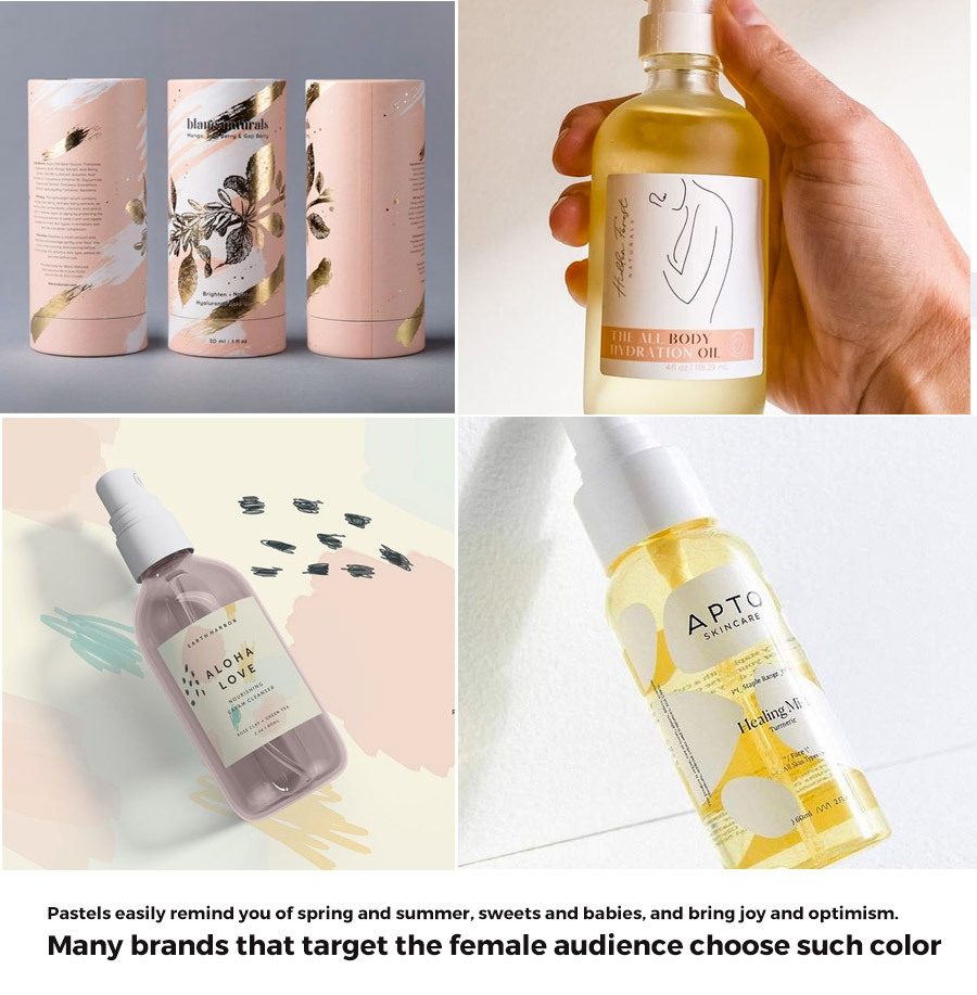
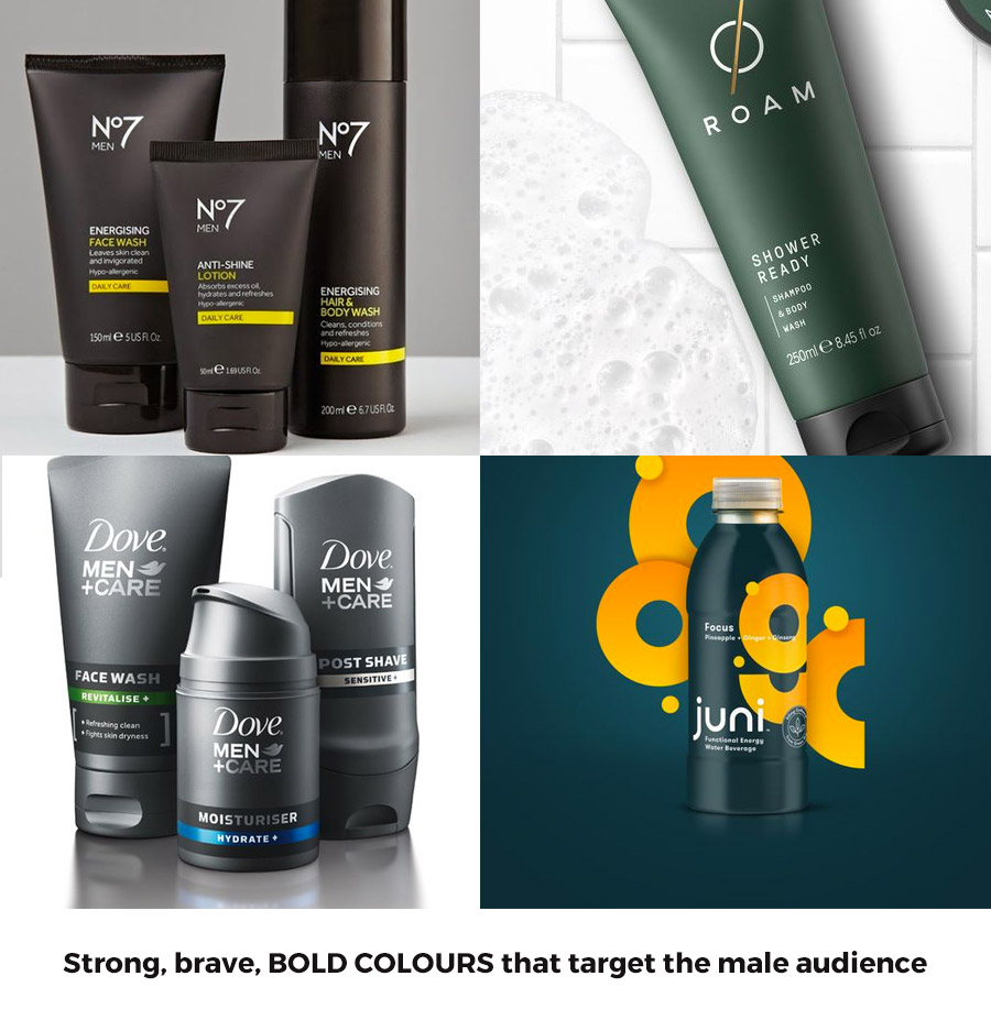
Remember to brand yourself
The sole purpose of a strategic brand design is to focus on the seamless flow of communication with the target audience. The Colour palette and packaging design subconsciously convey a message to the buyers. It reveals those qualities of the organization that you want to layout to the consumers. Does the brand design depict whether the organization is entertaining, executive or rebellious?
Sephora, a leading cosmetic brand, decided on a black and white colour palette while the competitors opted for pink, red, peach etc.

Take into account cultural preferences
Colours have cultural influences which alter people’s perceptions. Different ethnicities have contrasting customs and aspects. Thus, it becomes essential to familiarise ourselves with the customer’s culture to develop a contrasting fusion of colour and packaging design. An ideal branding agency would keep in mind the cultural influences affecting the colour, resulting in the shift of brand opinion or the objective conveyed through colour and brand design.
For example, the colour black depicts sadness and mourning in the Western part of the world.

Maintain design and typeface consistency
The colour palette chosen should fuse well with the fonts as it’s the colour palette and the typeface of the packaging design that acts as a medium of delivering the brand value to the consumers. The font carries the message to the buyers, and the colours chosen should contrast with the typography.
For example, the BBC uses Black Bold Capital lettered font to convey a valiant perception of the brand.
Keep your brand colour consistent
It is why colour is essential to adhere to the brand’s essence, maintaining its consistency through the shade and tint of the colour palette. When you choose a colour palette for your brand or packaging design, go on to create a recalling image of the organization in the audience’s minds. Thus, the colour becomes a brand identity that identifies itself without a logo or brand name.

For example, Doritos, a leading snacks brand, changed its packaging over the years but continued to maintain the brand identity by proceeding with red colour in the new packaging design, keeping their brand identity.
Conclusion
Significant colour and packaging design evoke consumers’ interest in your products inciting action to make a purchase decision. We hope you have a refined idea of colour psychology and its essential role in the marketing industry.
Here, we talked about how branding colour palettes influence brand identity and their significant role in promoting brand awareness. If you have thoughts on applying the concepts to your business, share your queries as comments below or on our website.
Author: Anush Malik

Being a strategist’s head and a long term visionary personality aims to achieve excellence in branding, packaging and digital marketing field. My 15 years of design experience and masters degree ais my strength which keeps me motivated and keep me going positively. I have participated in extensive branding design conquests in India, USA, Australia and New Zealand with winning zeal. My objective is to encourage start-ups and hence involves actively in the articles which will act as a productive intake of knowledge for them. Do connect me personally via my LinkedIn and I love to share my expertise with you.Posted in Bottle Label Design, Label DesignTagged best wine bottle label design, best wine label design, Bottle label design, creative wine label design, die cut wine label design, wine bottle label design, wine bottle label design ideas, wine bottle packaging design, wine illustration design, wine label design, wine label design company


