Gone are the days when you just had to create a menu and a banner and were done branding your food business! In the digital era, where most food orders come from online sources, you need to showcase your best dishes on the official website apart from the regular menu cards. It is the ultimate tool to attract, inform, engage, and retain customers. So many websites make your mouth water as you enter their homepage, right? Such websites convince you to place an order and try out their food right at that instant! That’s the power of building a strong online presence!
So, what makes a food website stand out? From vibrant colours to tempting food photography and whatnot, in this blog, we will explore 639+ stunning food website design ideas that cater specifically to all the foodies of India! From desi street food vibes to high-end dining aesthetics, we have the best strategies and ideas to kickstart your inspiration. Let’s dive in!
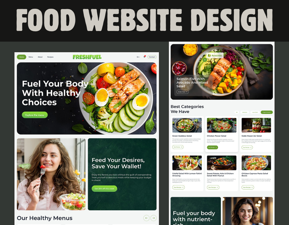
Table of Contents
Why should you even care about a food website design?
Have you ever wondered why some food businesses seem to click instantly while others continue struggling to attract customers? A big part of that magic comes from website design. In India, where food is celebrated at every corner, your online platform needs to do more than look good – it must connect well with your audiences.
Think about it. Your customers land on your website. They are not just looking at the menu but the entire experience that they will expect from your establishment. A well-designed website can make ordering food effortless, while a cluttered or outdated design might send them straight to your competitor. Thus, in a market as dynamic as India’s food industry, you need to create a visually appealing, easy-to-navigate, and professional website that sets your food business apart. It is not just a digital space – It is the face of your brand!
Food Website Design Inspirations by Category (639+ Ideas)
Looking for the perfect website design ideas for your food business? Whether you are running a cosy cafe or a thriving food delivery service, your website should be as tempting as the dishes you offer. Let’s dive into some categorie-specific inspirations for your upcoming food website!
1. Restaurant Website
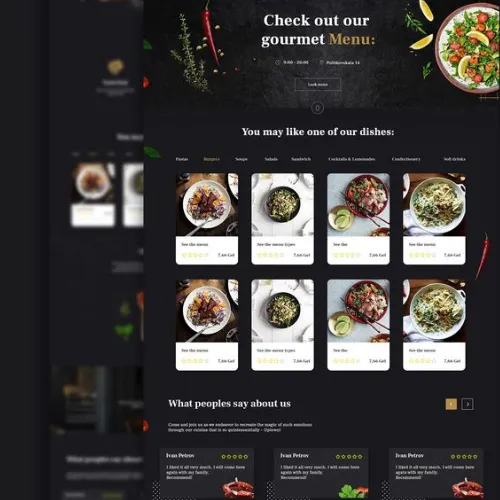
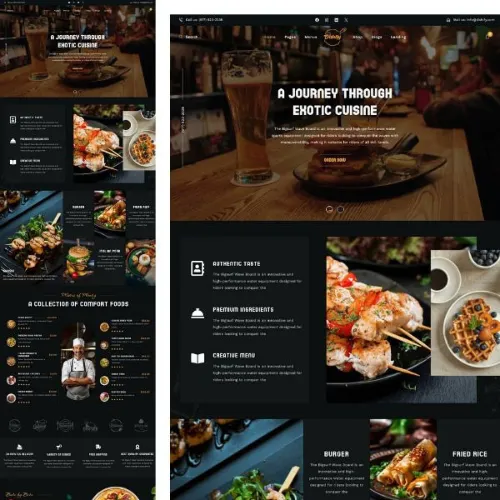
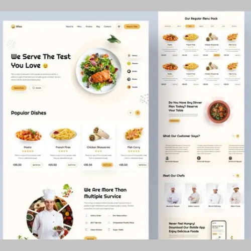
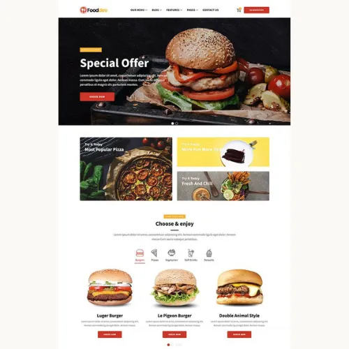
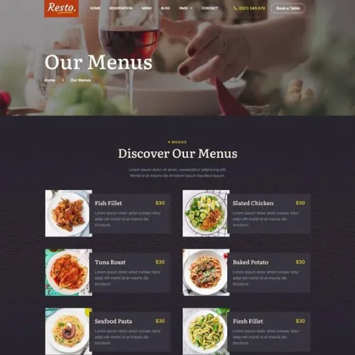
When it comes to your restaurant websites, first impressions really matter! You need to have a website that mirrors the ambience of your restaurant, whether it’s fine dining or a casual eatery. Stunning food photography, rich colour schemes, and easy navigation can create a perfect virtual experience that reflects the vibe of your restaurants. Have a simple yet elegant layout with menu highlights, customer reviews and a reservation option to keep your diners coming back for more.
Source: https://in.pinterest.com/pin/873346552737362141/
Source: https://in.pinterest.com/pin/251146116754528944/
Source: https://in.pinterest.com/pin/864972672157021106/
Source: https://in.pinterest.com/pin/906842074941987434/
2. Food Blogs Website
Running a food blog? Your website should scream creativity! From mouth-watering recipe images to a clean, readable layout, your design needs to be easy to digest (pun intended). Consider using bright visuals, quick-to-load pages, and well-structured categories that allow users to explore recipes, tips, articles, and reviews easily. It is not just about the content but the entire experience!
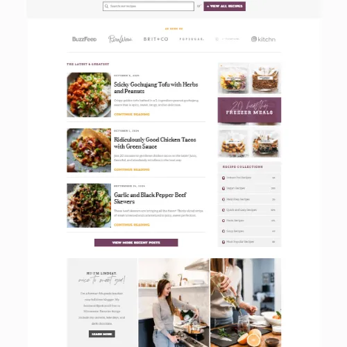
Source: https://pinchofyum.com/
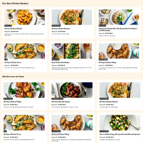
Source: https://iamafoodblog.com/
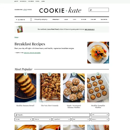
Source: https://cookieandkate.com/how-to-start-a-food-blog/
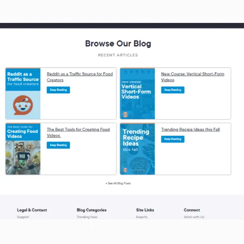
Source: https://www.foodbloggerpro.com/blog/our-favorite-food-sharing-sites/
3. Cafes & Bakeries Website
A warm and welcoming website is key for cafes and bakeries. Imagine showcasing your best-selling cupcakes or freshly brewed coffee right on the homepage. A minimalist design, paired with soft colours and simple fonts, can capture the real charm of your cafe. Add special features like a daily special section, social media integrations, or a virtual tour to give visitors a taste of what’s brewing in your business!
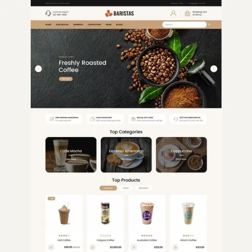
Source: https://in.pinterest.com/pin/797418677792067435/
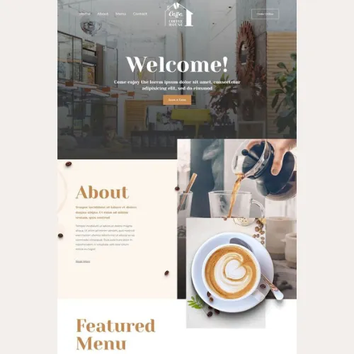
Source:https://in.pinterest.com/pin/317292736264957378/
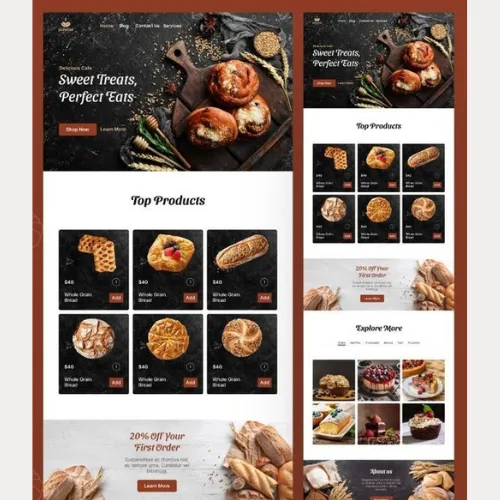
Source:https://in.pinterest.com/pin/401383385557994391/
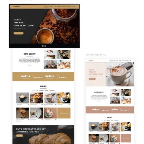
Source: https://in.pinterest.com/pin/916341855412154199/
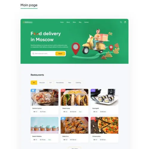
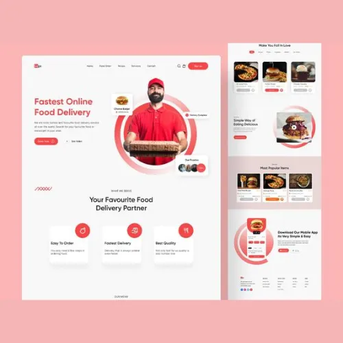
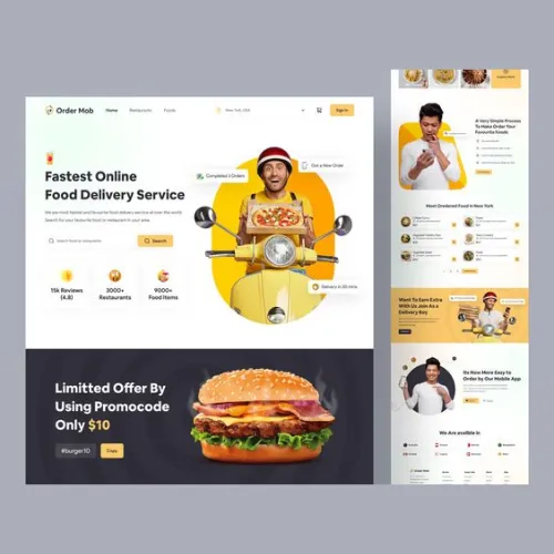
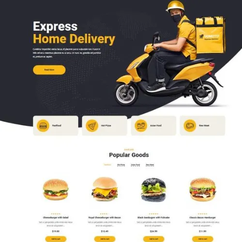
4. Food Delivery Services Website
With the growing demand for food delivery in India, having a fast and user-friendly website is crucial. Your customers are hungry, and they want quick access to the menu and the order. Add bold and clear CTAs and use mobile-friendly designs to make the entire process super seamless. After all, why should someone wait when they are just a click away from their next meal?
Source: https://in.pinterest.com/pin/916341855412154199/
Source:https://in.pinterest.com/pin/828873506449918529/
Source:https://in.pinterest.com/pin/1019995015602540970/
Source: https://in.pinterest.com/pin/1089378597339976326/
5. Catering Services Website
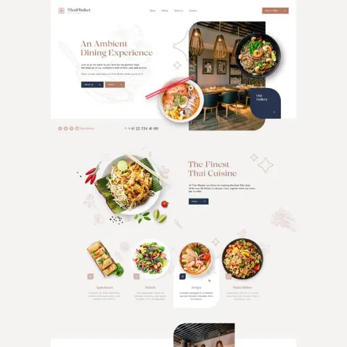
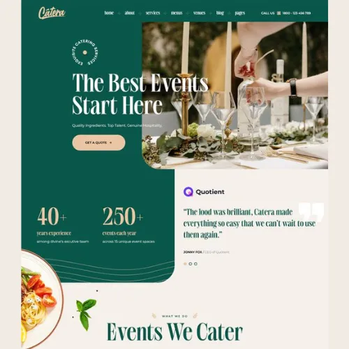
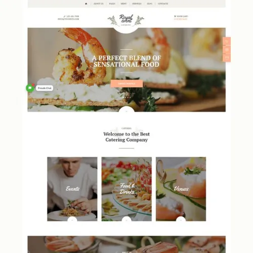
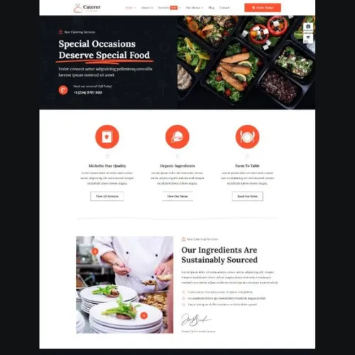
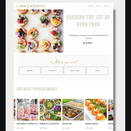
A catering business’s website needs to display professionalism and creativity. High-quality photos of catering events, client testimonials, and customisable packaging options really boost credibility. A sleek design with easy contact options will allow potential clients to inquire or book services hassle-free. Highlight your specialities and ease of ordering loud and clear on your website!
Source: https://in.pinterest.com/pin/611504455680192062/
Source:https://in.pinterest.com/pin/921760248722918115/
Source:https://in.pinterest.com/pin/921760248714064831/
Source: https://in.pinterest.com/pin/694046992602971948/
Source:https://in.pinterest.com/pin/111393790778954194/
Source: https://in.pinterest.com/pin/558657528794920882/
6. Grocery & Specialty Stores Website
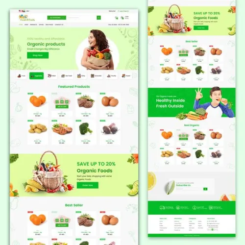
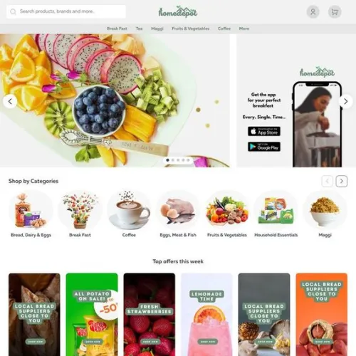
If you run a grocery or speciality store, your website should offer a seamless shopping experience. Make it extremely easy for customers to browse, add to cart, and check out. Minimise the number of steps to reduce the chances of cart abandonment. Have clean product categories, search filters, and customer reviews to enhance the entire shopping journey. Consider adding vibrant visuals and highlighting special offers or new arrivals to keep shoppers coming back for more!
Source: https://in.pinterest.com/pin/698269117257509836/
Source:https://in.pinterest.com/pin/605945324893779253/
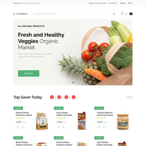
Source:https://in.pinterest.com/pin/162270392815123323/
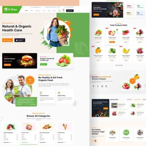
Source: https://in.pinterest.com/pin/750975306645770937/
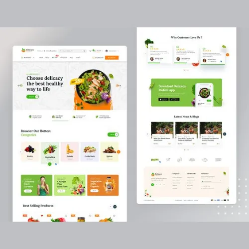
Source:https://in.pinterest.com/pin/667517976033349626/
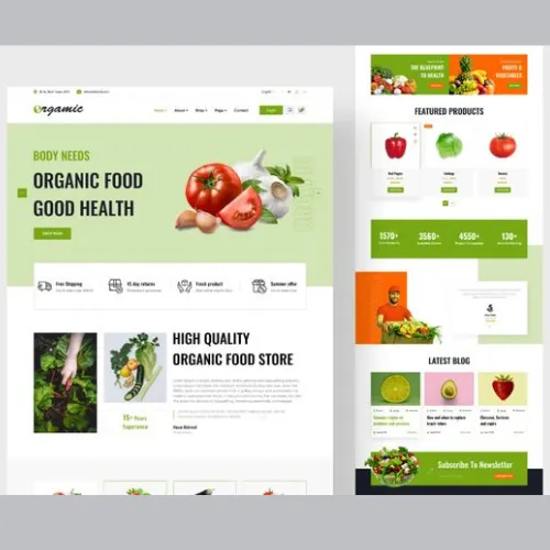
Source: https://in.pinterest.com/pin/300263500166583917/
What types of website design work best in the food industry?
Wondering what makes a food website irresistible? It’s all about striking the right balance between visual appeal and functionality. In the food industry, a cluttered website can be just as off-putting as a messy plate of food. So, what exactly works best here?
Simple, clean designs are often a winner! Think about a layout where your customers can easily browse the menu, check prices, and place orders with a few clicks! For Indian businesses, vibrant, bold colours and eye-catching food photography can create an inviting atmosphere. Imagine scrolling through a restaurant website where the images alone can make you hungry—sounds delicious, right?
Interactive elements like customer reviews, engaging CTAs, and social media links can really transform your website into a seamless experience. Don’t forget mobile friendliness, as most of your customers are already scrolling through the menu from their mobiles right now! Make your website responsive and quick to load. Make the design super interesting and appealing to create a delicious online experience for your customers!
Steps To Craft the Perfect Food Website Design
Crafting the perfect website for your food business is like preparing a signature dish—you need to get the right ingredients in the right proportions! Here is a step-by-step guide to help you whip up the most engaging, functional, and visually stunning website that entices your customers every time!
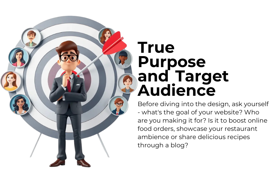
1. Define Your Website’s True Purpose and Target Audience
Before diving into the design, ask yourself – what’s the goal of your website? Who are you making it for? Is it to boost online food orders, showcase your restaurant ambience or share delicious recipes through a blog? Defining the purpose and understanding your target audiences is the prime key. Whether your customers are urban foodies who love trying out new cuisines or young professionals who like quick everyday dishes, knowing this will help shape your website design choices well. This will ensure that your website still feels relevant and engaging for the people you want to reach.
2. Choose a Visually Appealing Design Layout That Works And Wows Customers
Choose a visually appealing yet functional layout for your website. Not only does it look good, but it also works better! Choose a design that truly complements your brand style. For example, minimalist designs are excellent for high-end dining experiences, while cafes or bakeries can have a quirky and vibrant look. Make it easy to navigate. Avoid overwhelming your visitors with too many options or cluttered visuals. Keep it simple, stylish and easy to understand!
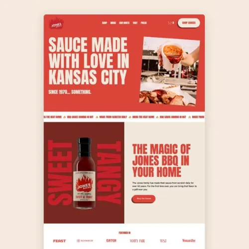
Source: https://in.pinterest.com/pin/107453141104347656/
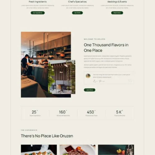
Source:https://in.pinterest.com/pin/540009811584245642/
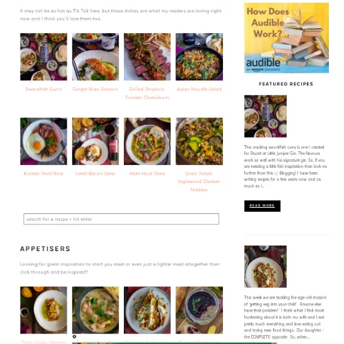
Source:https://www.anotherfoodblogger.com/
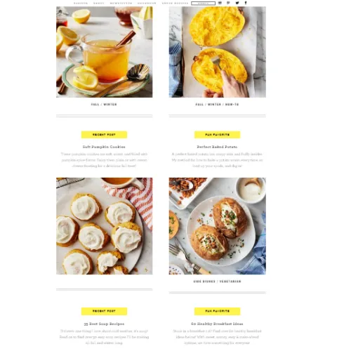
Source: https://www.loveandlemons.com/
3. Feast the Eyes with High-Quality Food Images and Videos
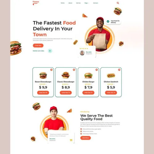
Nothing sells food like stunning visuals! Ensure that your dishes look equally tempting through the website as they taste! Choose high-quality images and videos of your dishes to be at the forefront of your website. This will make your visitors feel hungry just by looking at the screen. Showcase your best offerings with professional images and short, engaging videos. After all, we all love to check out the food and how it looks before trying out something new, don’t we?
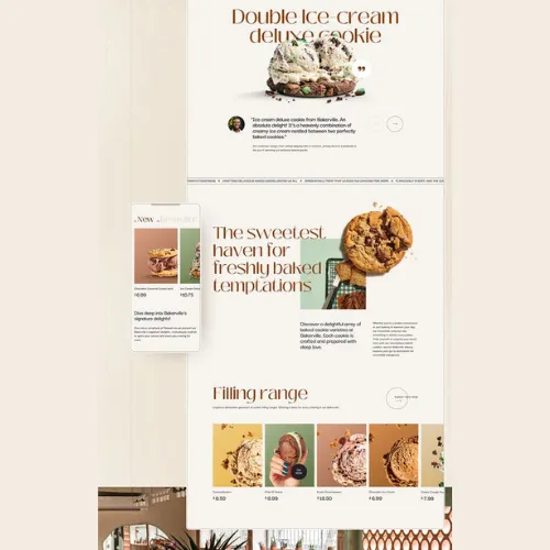
Source: https://in.pinterest.com/pin/579205202116497366/
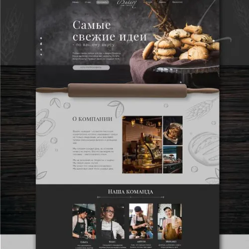
Source:https://in.pinterest.com/pin/689543392961901296/
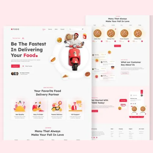
Source:https://in.pinterest.com/pin/807622145692015589/
Source: https://in.pinterest.com/pin/358669557839834543/
4. Make it Mobile-friendly!
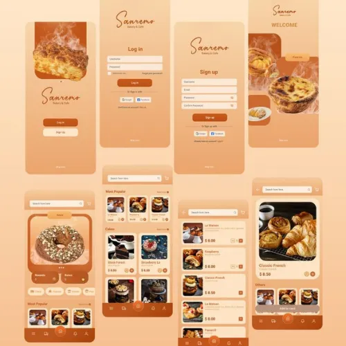
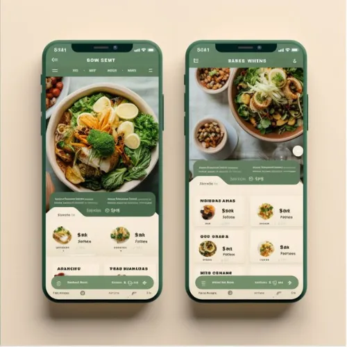
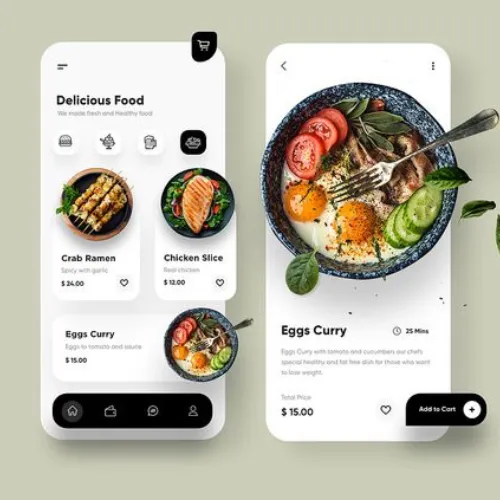
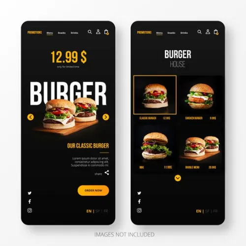
In India, where a majority of food orders are made via smartphones, your website must be equally mobile-optimised. Build a super responsive design that ensures that your website looks great and functions seamlessly on all devices. Whether it is a desktop, tablet, or smartphone, a difficult-to-load website can quickly increase cart abandonment rates! You wouldn’t ever want that for your food business, right?
Source: https://in.pinterest.com/pin/603552787594706814/
Source:https://in.pinterest.com/pin/5770305768162932/
Source:https://in.pinterest.com/pin/951104015074514521/
Source: https://in.pinterest.com/pin/611363718194937033/
5. Integrate User-Friendly Navigation and Menu Structure for a Seamless Experience
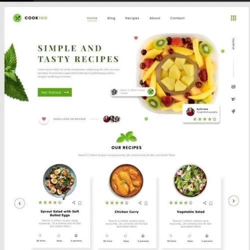
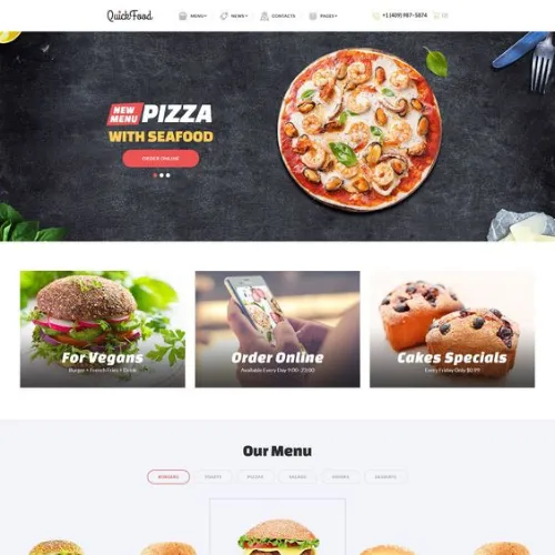
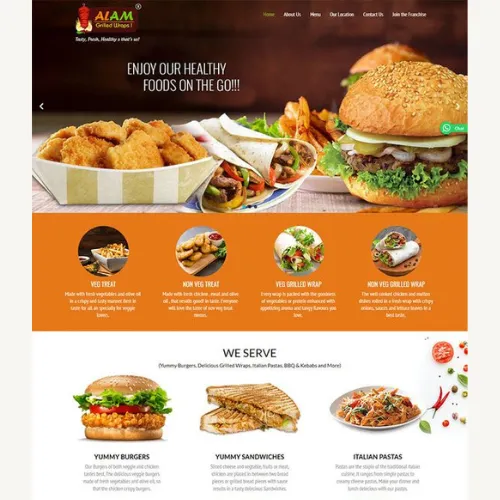
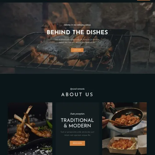
Have you ever visited a website that needs clarification to navigate? You need to learn how to get to the beverages amidst so many options! This is why your website should have clear, intuitive navigation. Whether your visitors are looking to browse the menu, check reviews, or place an order, they should be able to find everything easily. Make sure your menu structure is simple and easy to follow. Break down your menu into categories like starters, mains, desserts, etc, to avoid overwhelming your customers with too many options!
Source: https://in.pinterest.com/pin/5348093302913222/
Source:https://in.pinterest.com/pin/18718154688481445/
Source:https://in.pinterest.com/pin/409686897355115716/
Source: https://in.pinterest.com/pin/1618549862999487/
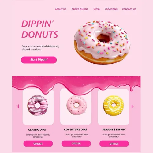
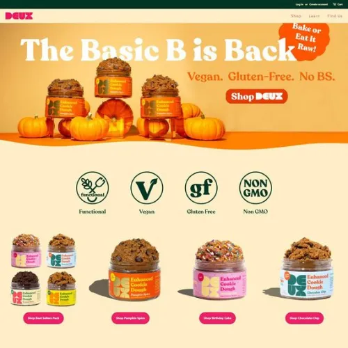
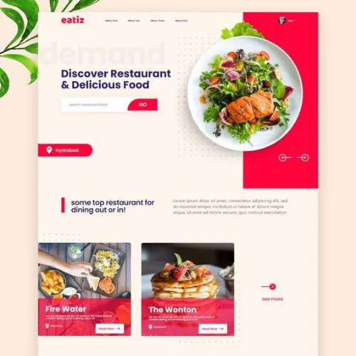
6. Incorporate Strong Call-to-Actions (CTAs) for Easy Ordering
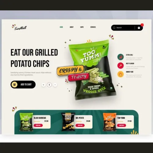
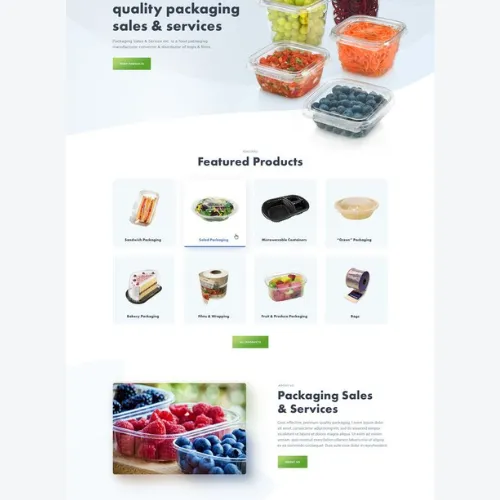
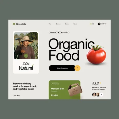
You must grab their attention to convince them to try your food. This is where a strong CTA can do wonders! Use strong and convincing phrases like “Order Now”, “Reserve a Table”, and “Explore Our Menu”. Make them visible and engaging and guide visitors toward the next step. Don’t be afraid to be bold and creative here. Ensure that your CTAs stand out with bright colours or eye-catching designs. If they are too small or hard to find, chances are you might lose a potential sale.
Source: https://in.pinterest.com/pin/179581103889968669/
Source:https://in.pinterest.com/pin/869617009282383924/
Source:https://in.pinterest.com/pin/90564642499579279/
Source: https://in.pinterest.com/pin/42784265204760201/
Source:https://in.pinterest.com/pin/470274386107999714/
Source: https://in.pinterest.com/pin/939633909750972259/
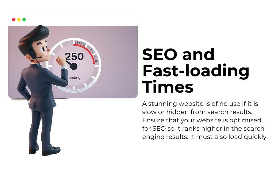
7. Speed Up Your Website for SEO and fast-loading Times
Finally, a stunning website is of no use if it is slow or hidden from search results. Ensure that your website is optimised for SEO so it ranks higher in the search engine results. It must also load quickly. After all, no one likes to wait for a page to load, especially when they are hungry! Hire someone seo professional at this stage, as they will know the right technical aspects to make your website appear high on the search results and quickly load whenever a foodie visits your website!
Final Thoughts – CTA
Crafting the perfect food website is more than just picking pretty pictures and fonts – it is about building an experience that connects with your audience and drives them to take action. Every step counts, from understanding your audiences to using eye-catching visuals and ensuring mobile optimisation. What other aspects of a food website make your mouth water? Feel free to share it in the comments below for our readers and get the discussion going!
If you are ready to take your food website to the next level, hire our best website designers at DesignerPeople to create a site that truly reflects your business and satisfies your customer’s cravings! We have just the right expertise to build something that gives true recognition to your delicious dishes through the eyes of the consumers!
Author: Anush Malik

Being a strategist’s head and a long term visionary personality aims to achieve excellence in branding, packaging and digital marketing field. My 15 years of design experience and masters degree ais my strength which keeps me motivated and keep me going positively. I have participated in extensive branding design conquests in India, USA, Australia and New Zealand with winning zeal. My objective is to encourage start-ups and hence involves actively in the articles which will act as a productive intake of knowledge for them. Do connect me personally via my LinkedIn and I love to share my expertise with you.


